Elements Of Design
The design elements realised here are related to a larger whole, to man and his relationship to the environment.
On the one hand, the ideas arise from perceptions and observations of the given conditions. On the other hand, they pursue the idea of enriching nature and the place as a whole and integrating things that already exist in a new way. Things are also elaborated so that they become even more apparent in their essence.
Humans perceive through consciousness whether an area, a house or a terrain is coordinated with other forms and stands in a certain relationship. Geometric proportions and the relationships created from them are perceived as harmonious, for example. One experiences that there is a relationship, a “spiritual cohesion” between the forms.
1. The interior
The calculation of the basic form
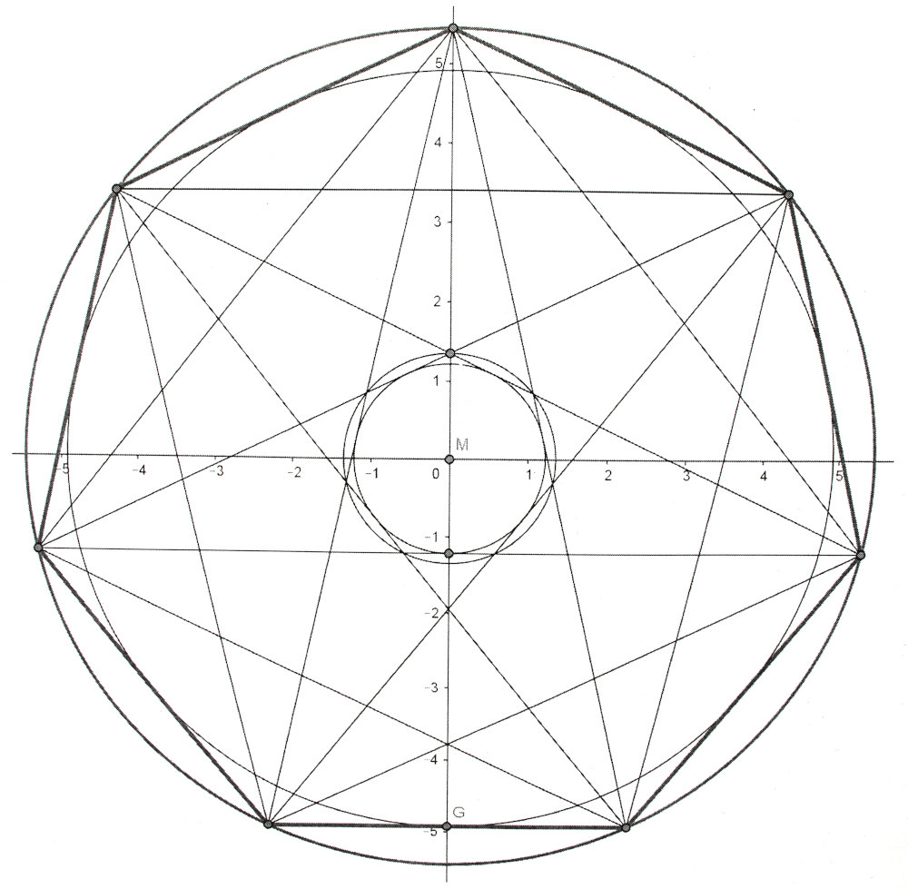
The construction of the house and its interior design is based on the circle shown here with the heptagon drawn in. A circle of equal area was calculated from the base area of the house. This circle measures a radius of 5.50 m. The corresponding seven-pointed star or heptagon was constructed from this circle.
This circle with its heptagon/star is the basis for all other measurements in the house and on the property.
The long, upward ascending form
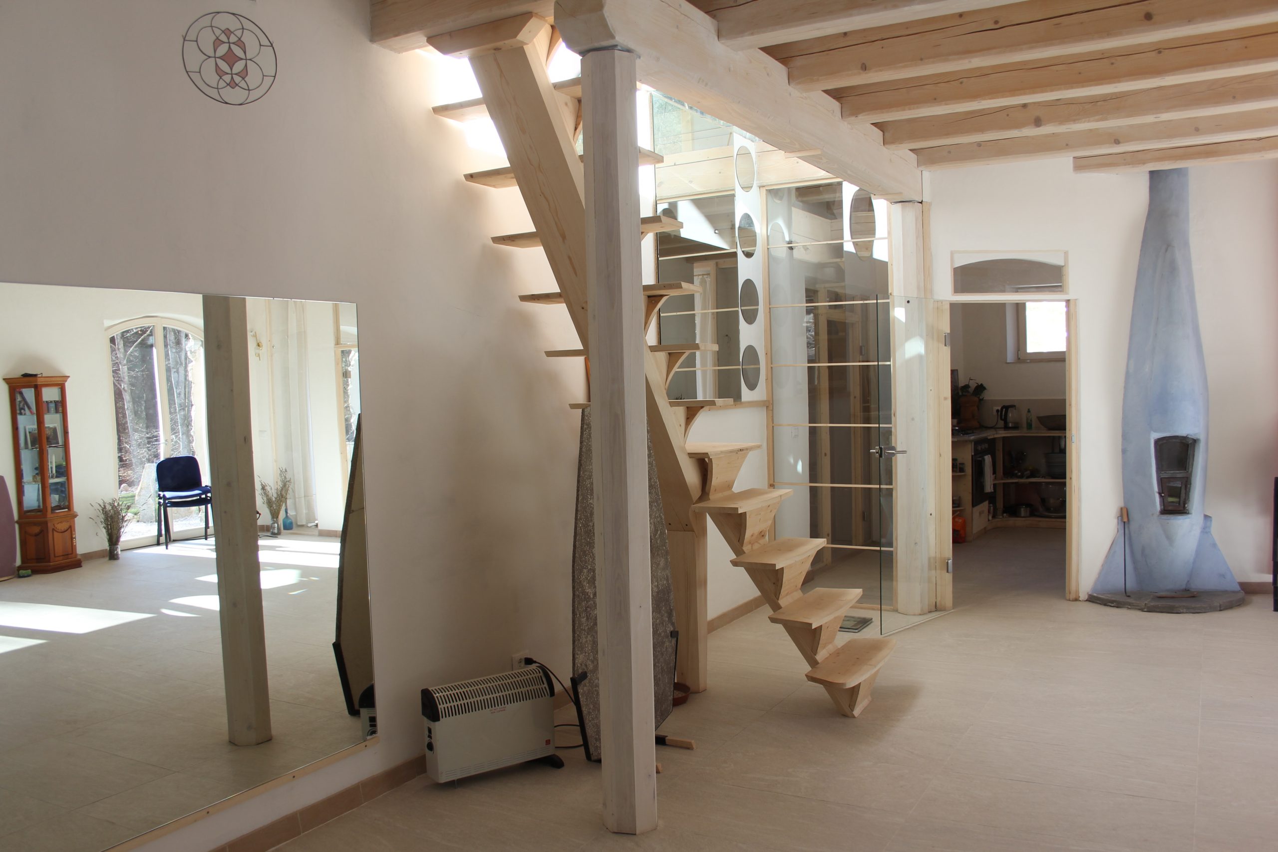
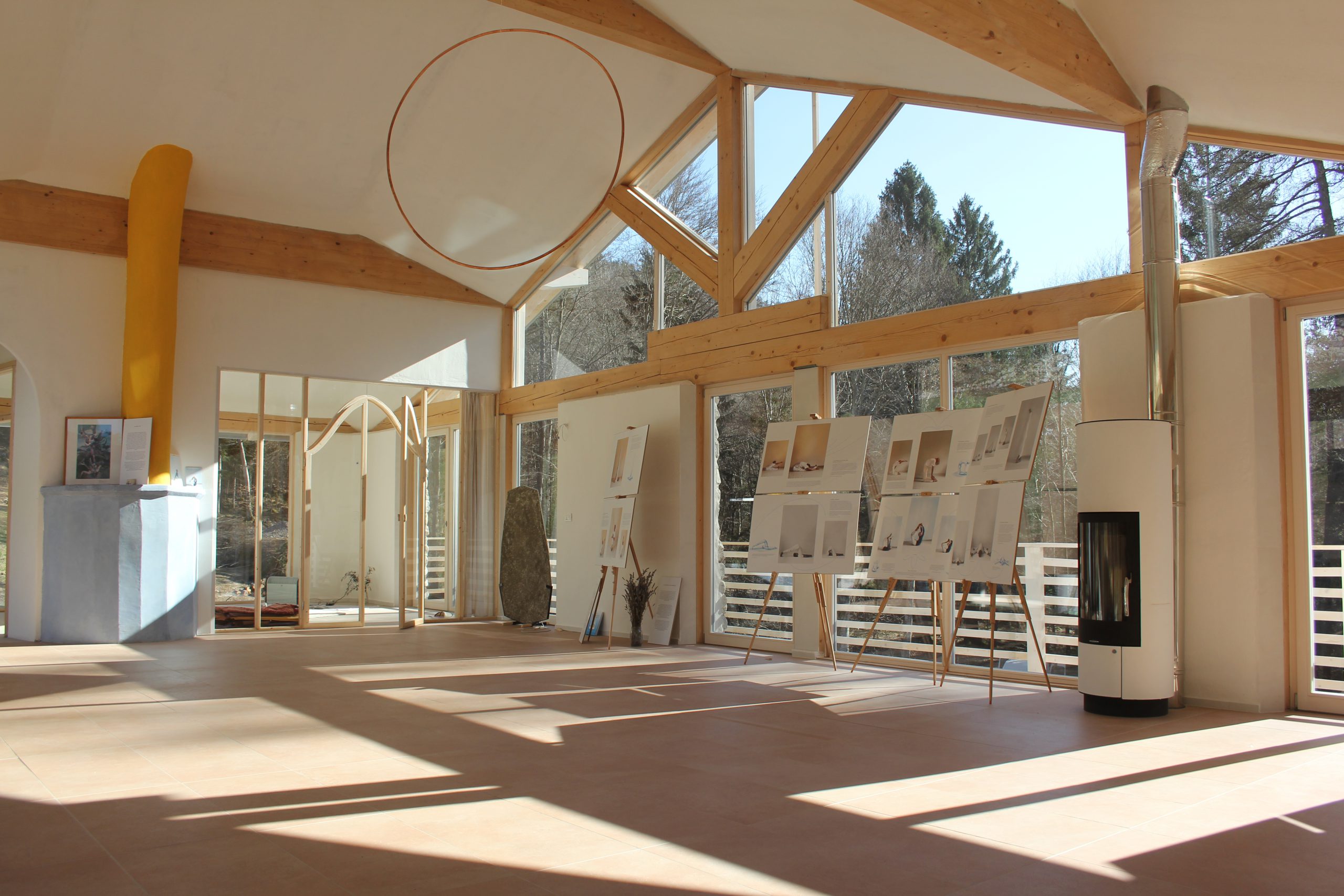
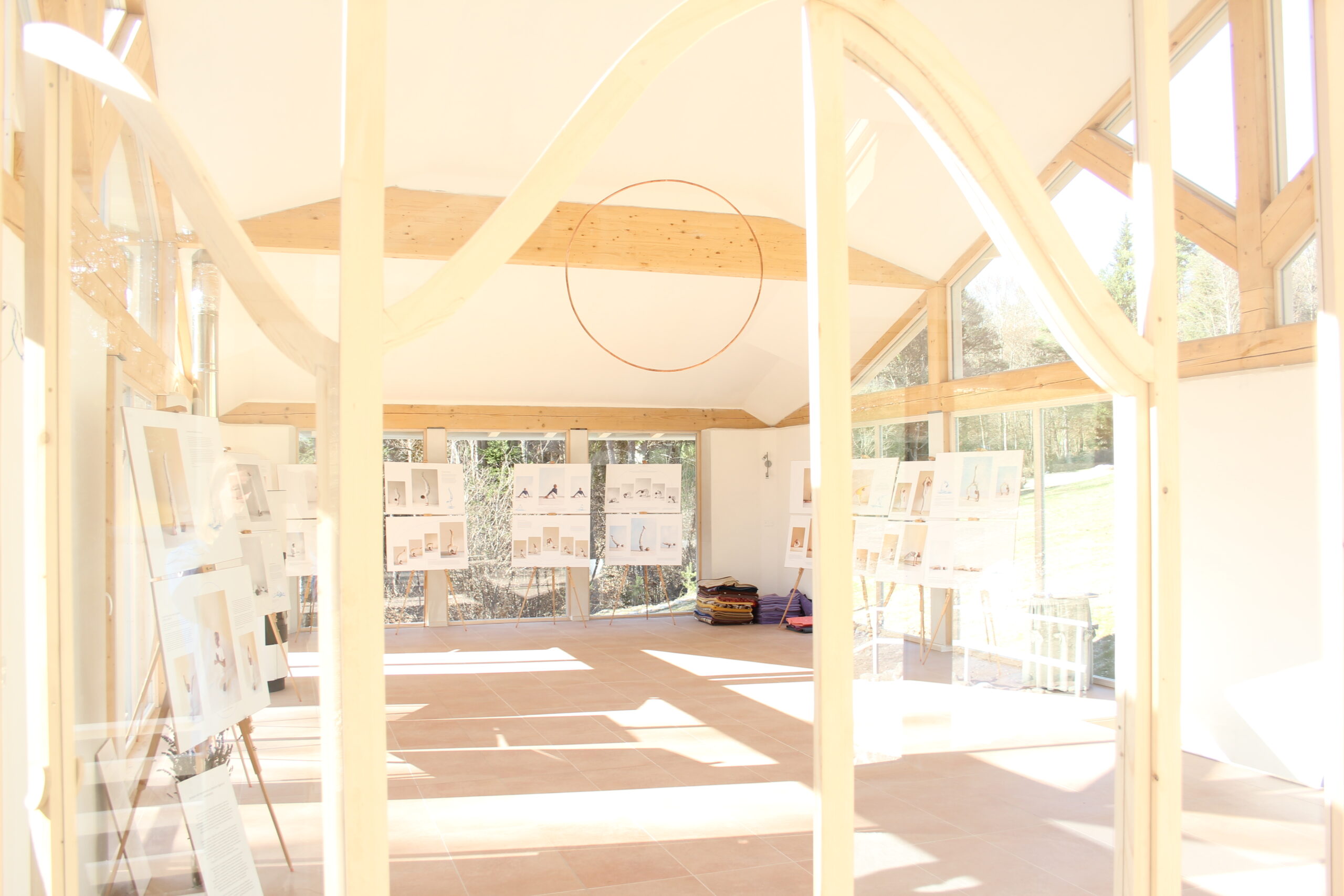
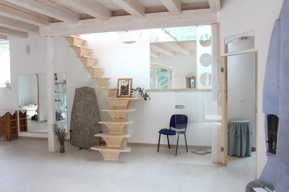
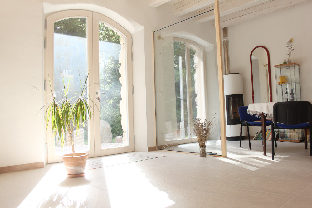
Why the heptagon? The number seven is attributed to the planet Saturn. Heinz Grill assigns to Saturn the characteristic of long, upward reaching, flame-like forms. The long windows reaching downwards, a stove in the shape of a flame, long wooden strips, they all emphasise the clear vertical and connect the floor with the ceiling.
The circulation of light
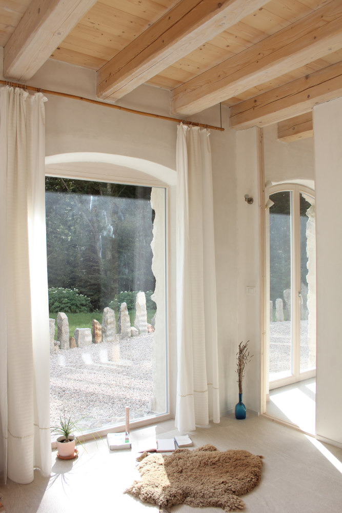
Another design element in the house is the circulation of light between the rooms and between upstairs and downstairs and inside and outside. The light should circulate as much as possible between the rooms.
Design elements for this are glass, openings, light colours and tiles and mirrors. The wood of the ceiling and exterior façade was tinted with whitish paint.
2. outdoor designs
The circles around the centre of the house
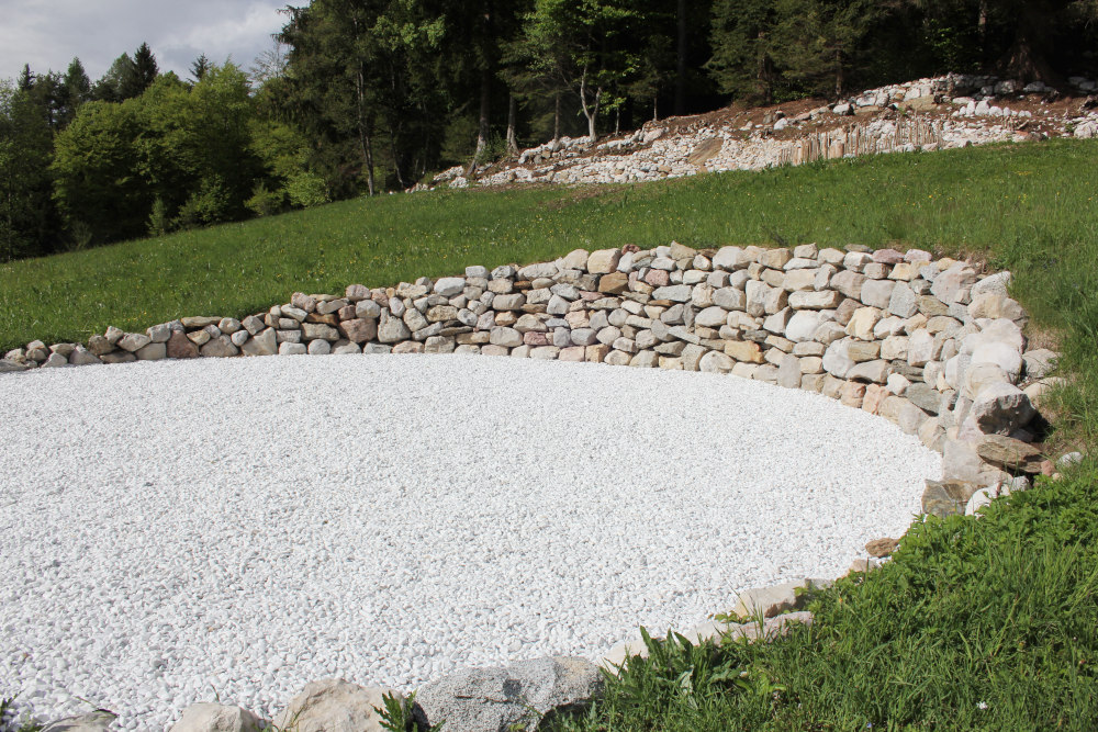
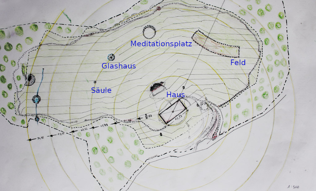
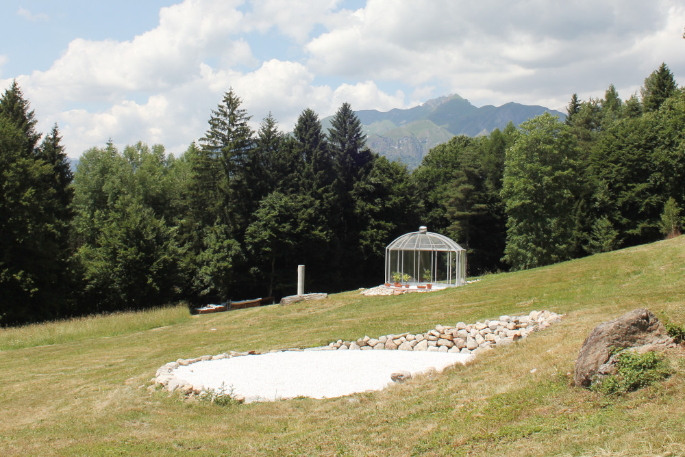
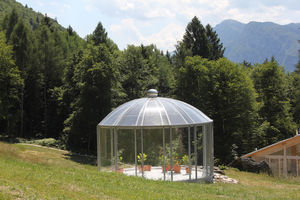
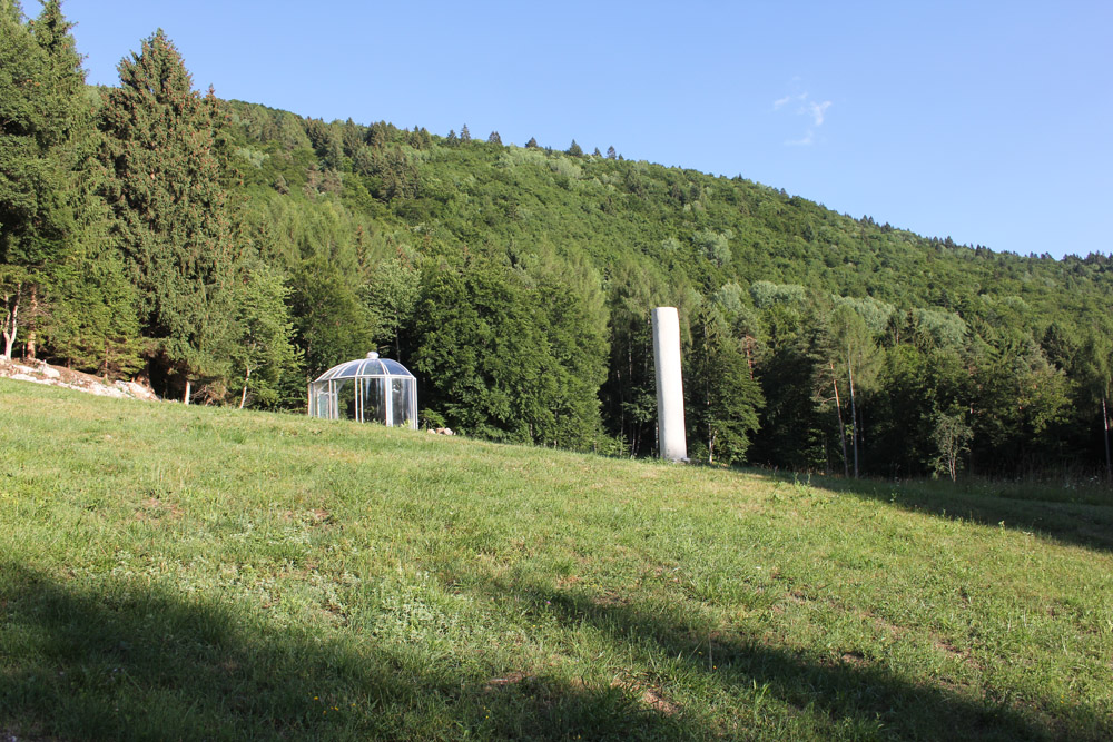
A total of 7 circles were measured around the house, all of which have the centre of the house as their centre and are each one house length apart, i.e. 15.83 metres. Various places on the large property are laid out towards the centre of the house, such as the round meditation place, the glass house and the column.
These places are all on the same circle.
Calculations based on the basic shape
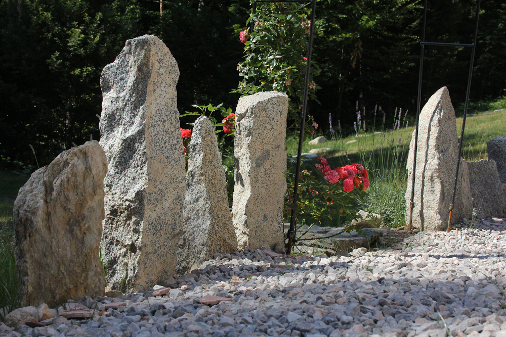
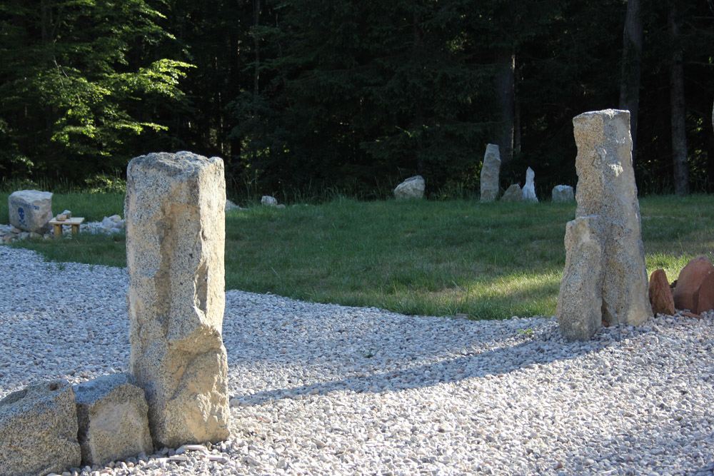
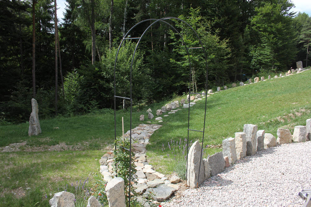
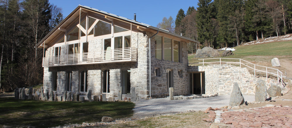
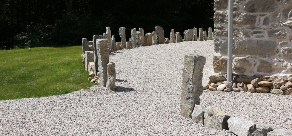
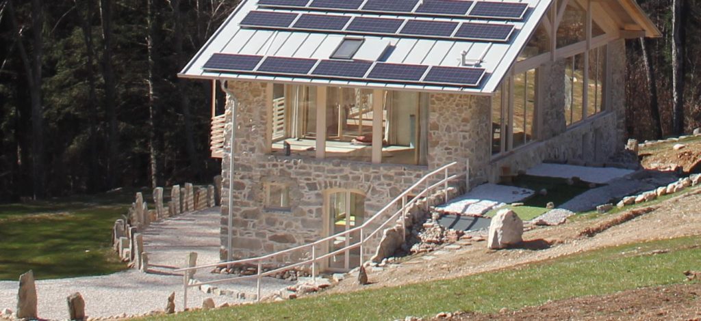
The granite stones placed in front of the house form a curve that was calculated from the house dimensions respectively the heptagon described above. The railing is also related to this basic shape.
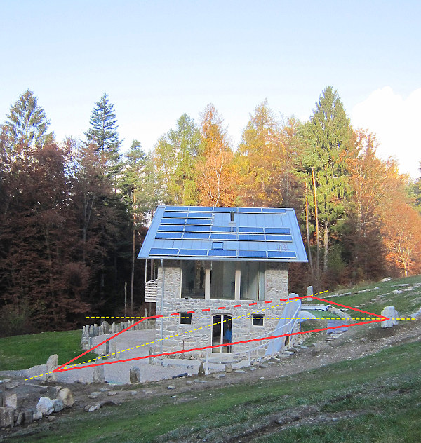
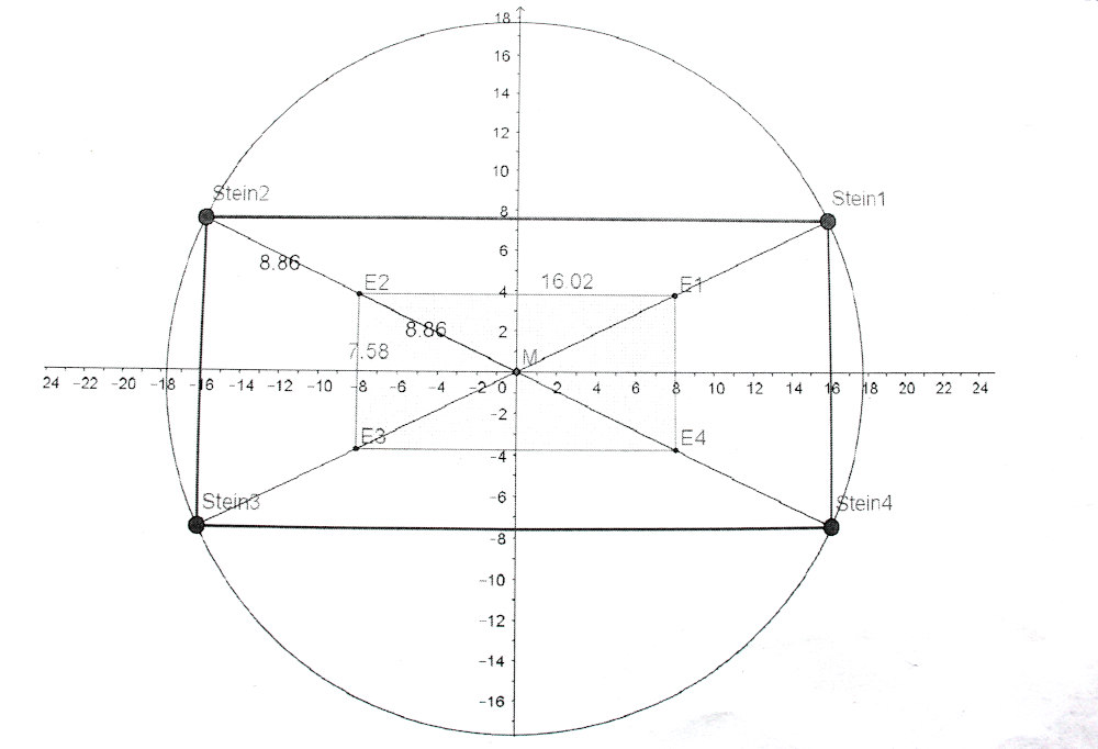
4 stones around the house
4 stones are placed around the house in extension of the diagonals. They form an imaginary rectangle. This rectangle gives the house a further centring.
The new integration of what already exists
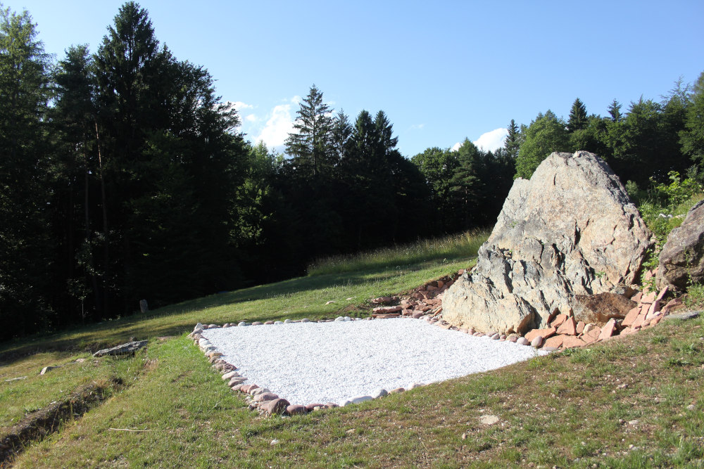
You can remove something that is already there, such as a large boulder or a tree, if it does not fit into the composition, but you can also integrate it and bring it into a new context.
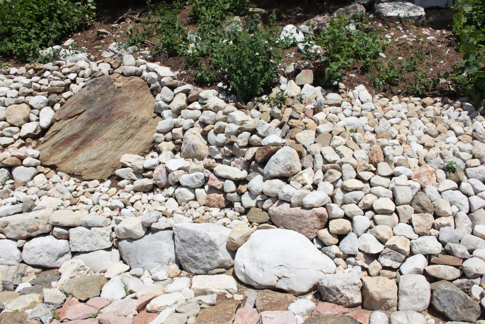
By creating the Jupiter square as well as the Trapez Square, an already existing large rock was integrated into the composition of the square. Some earth was removed so that it was exposed and then it was included as part of the square, as a design element. The stone thus takes on a new meaning, it stands out more strongly in its individuality for the consciousness.
3. Further elements of design
Stones
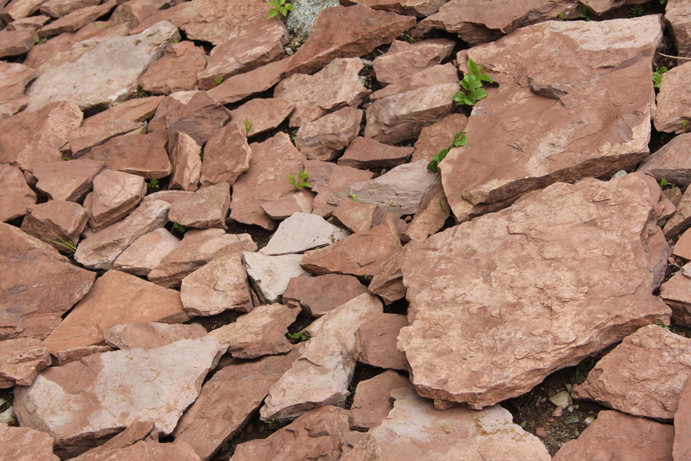
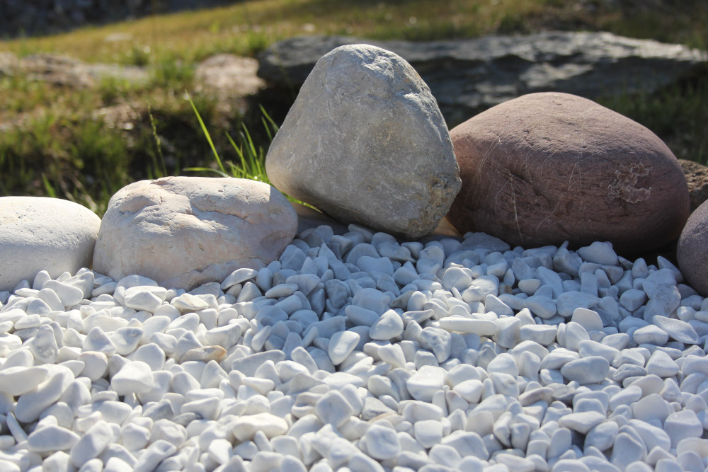
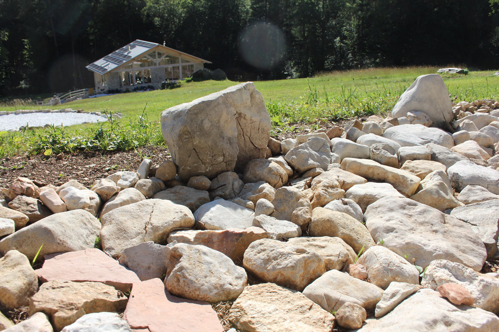
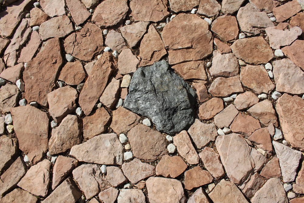
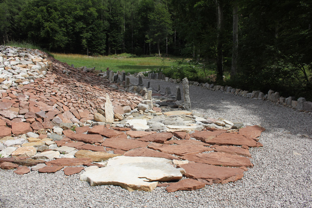
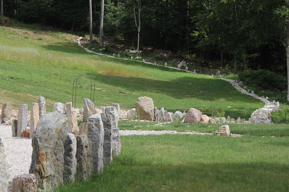
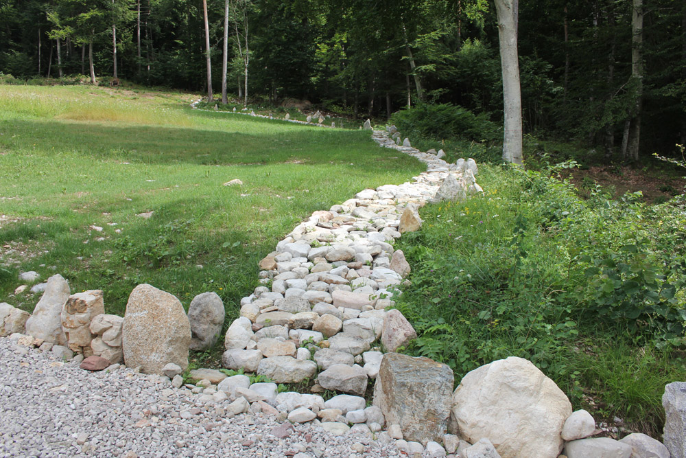
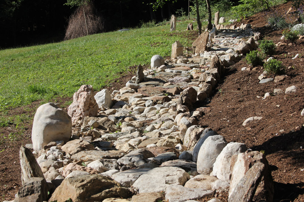
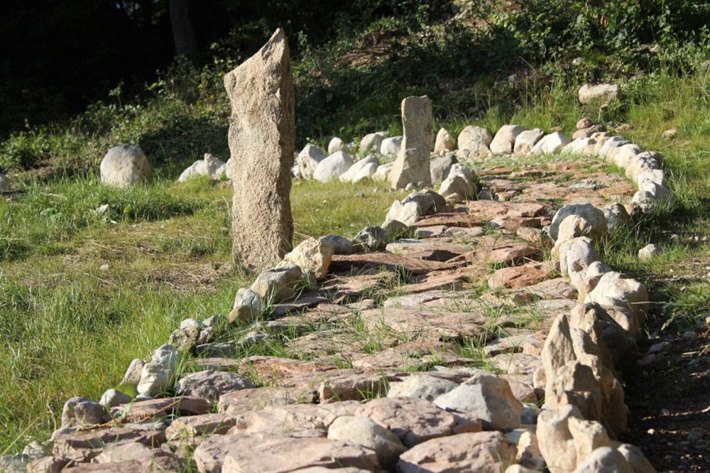
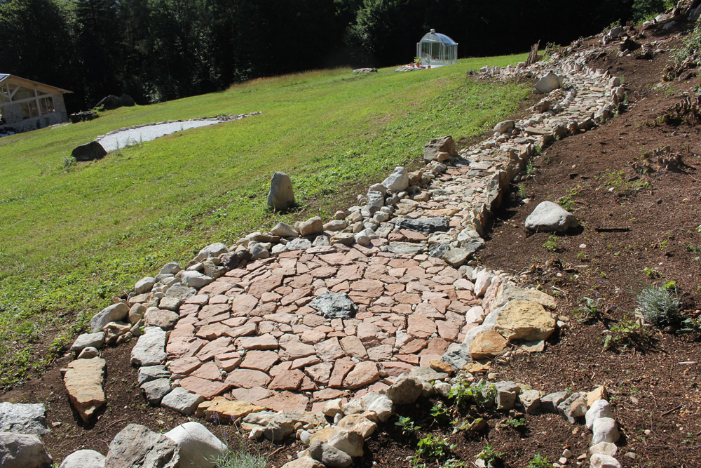
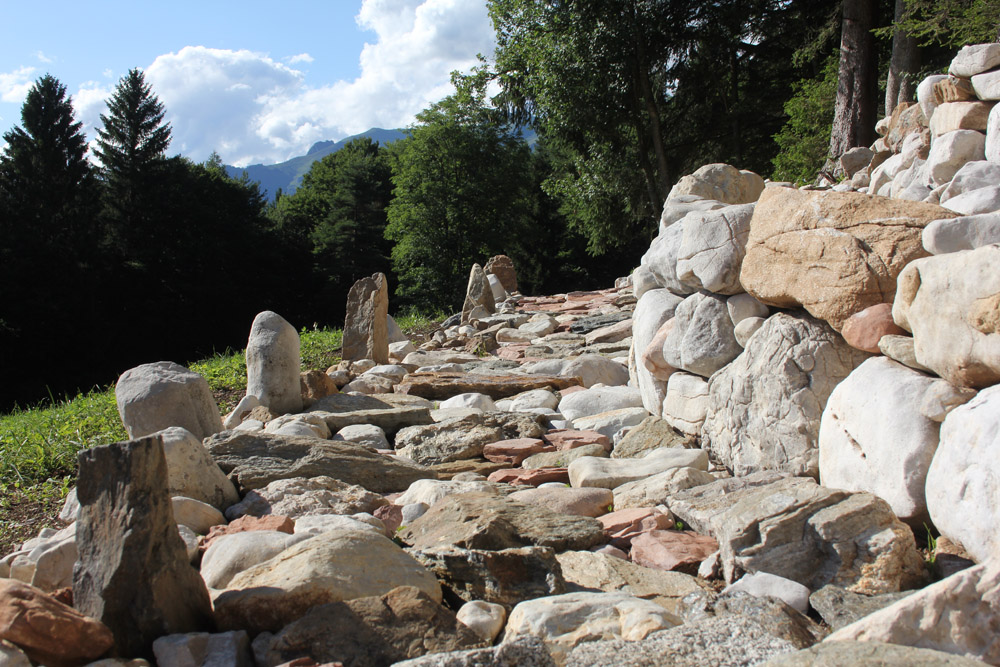
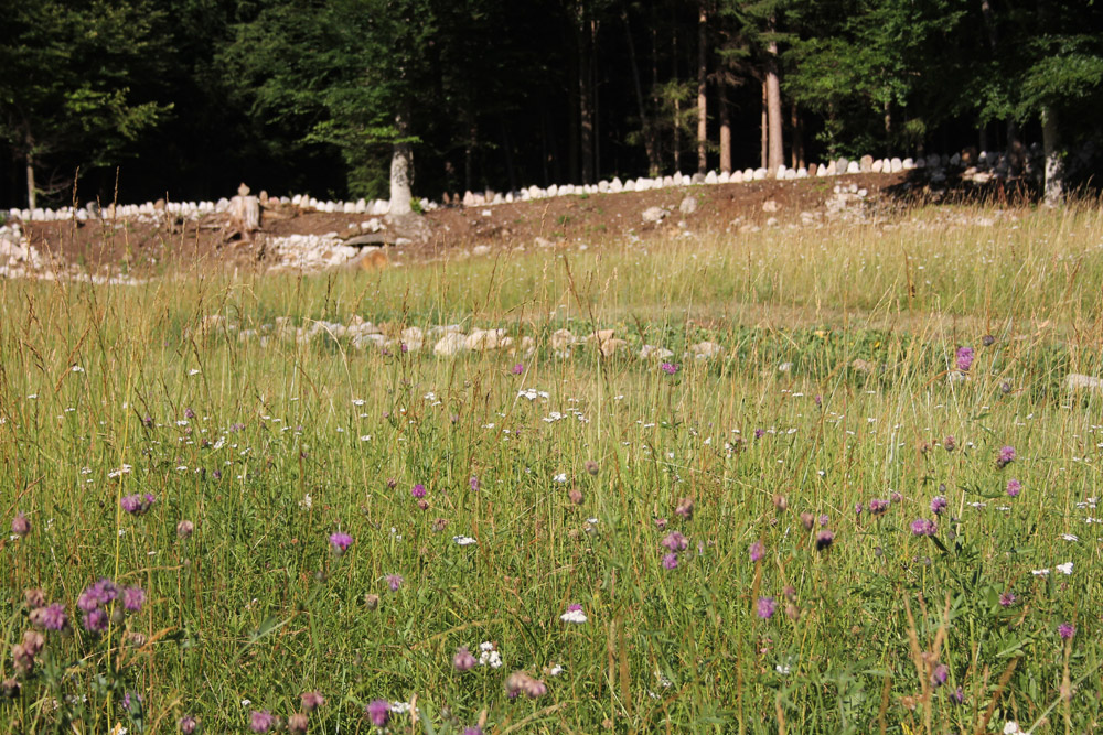
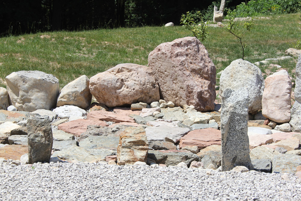
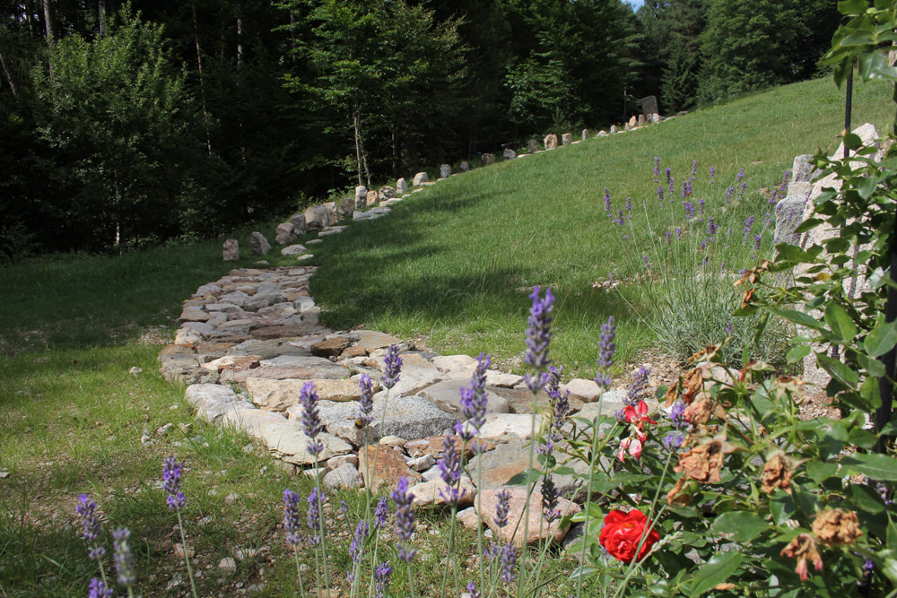
The plot shows many possibilities for stone design. The circular path is a “stone path”, the squares are built of stone. Different types of stone, slabs, round stones, narrow stones, high stones offer many design possibilities. For example, how does the effect of red and whitish limestone differ? What is the effect of limestone in contrast to granite? What is the effect of light on the different stones? White limestone reflects light very strongly. It was therefore also used above the property as a path boundary and path paving.
Curves
The circular path was built in gentle curves.
The view is thus enlivened and animated, in contrast to a path that is laid out in straight lines. Small stone walls on the slope are also designed in curved shapes.
Upright stones
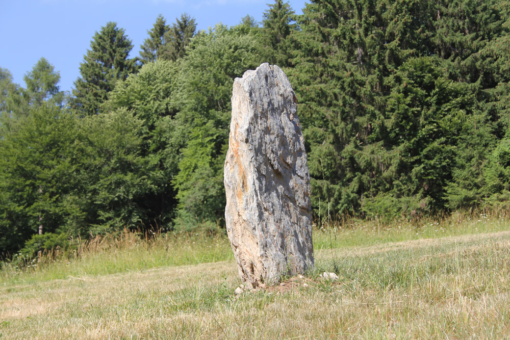
The stone that is upright “stands”. Next to the edge of the path, it gives rhythm to the path. The path detaches itself from its purely horizontal orientation and acquires a vertical dimension.
